The Steris Experience
Interactive sales tool lowering barriers on the path to purchase for current and prospective clients. Conveying a product catalog and context across several fully interactive 3D hospital departments.

STERIS is a global leader in infection prevention, decontamination, surgical, critical care technologies, and other procedural products and services. Primary focusing on healthcare, pharmaceutical, and medical devices for their customers.
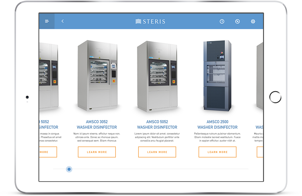
The company engaged us with the assignment of producing an interactive tool to aid their sales team. Providing valuable insights around their product catalog and addressing common and complicated customer questions.
The challenge
Innovating sales.
Gaining access to potential users for research and testing purposes as STERIS’ sales force worked all over the country and the project’s budget didn’t support travel to achieve these goals. As a work around we were able to hold sessions with project stakeholders, many of whom have extensive backgrounds in sales as well as staff members from the agency who closely matched the sales force’s main demographics and level of technical proficiency.
The solution.
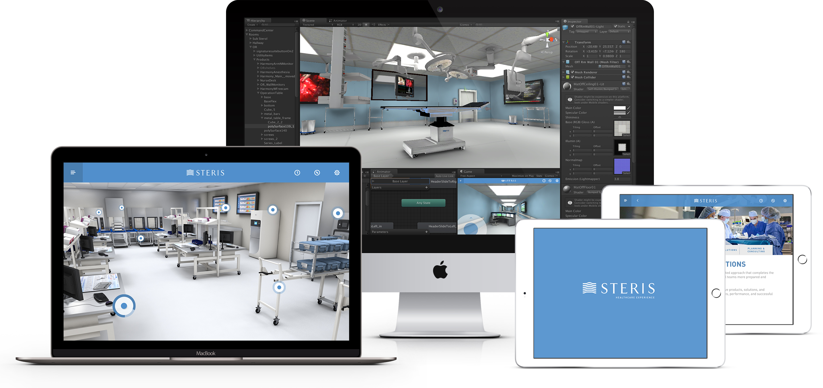
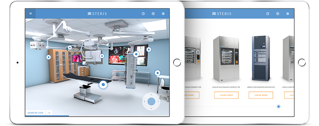
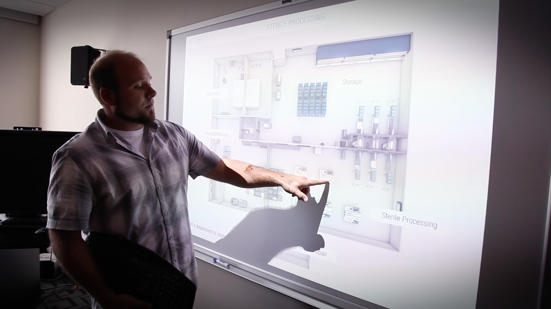
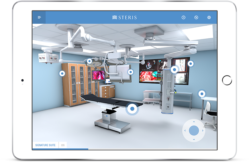
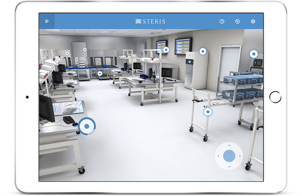
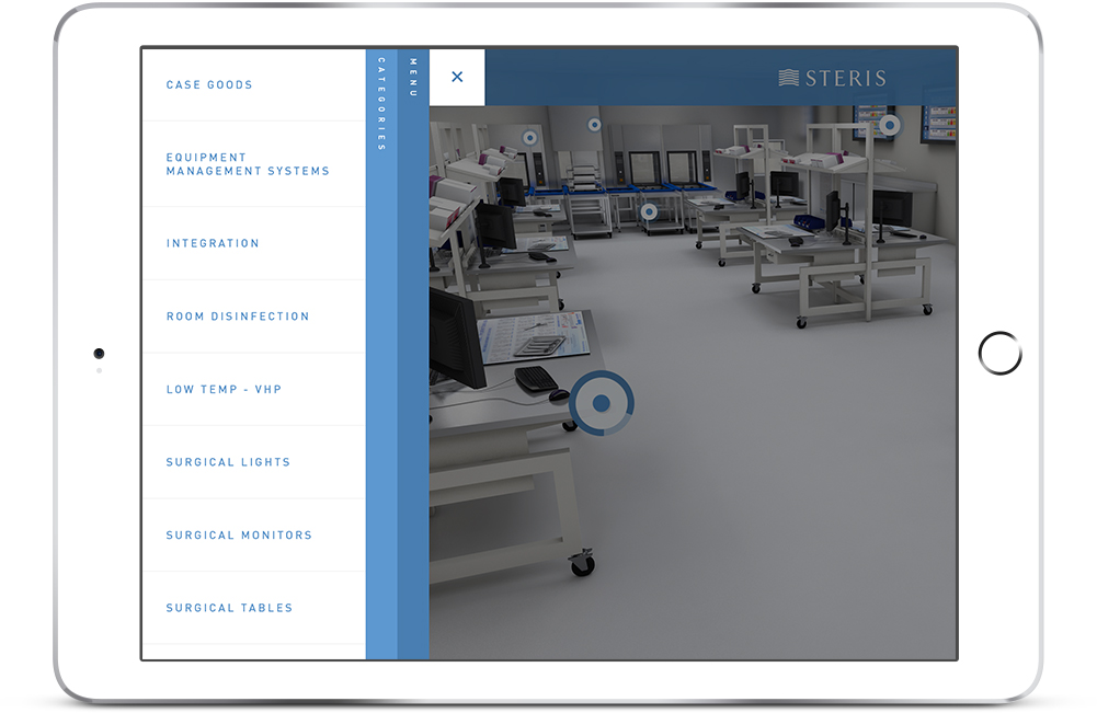
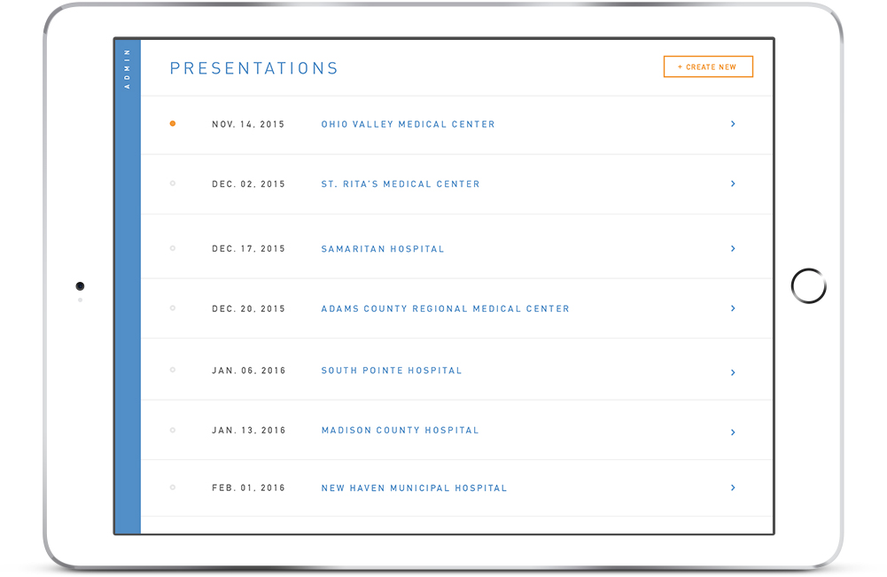
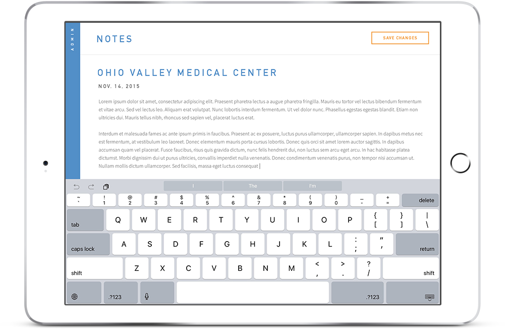
After several interviews and discovery sessions with the team and client stakeholders, we landed on a game-changing solution that would stand out against the competition. While preserving and improving its current function as a catalog, we enhanced the experience using the Unity game engine to place the user inside a virtual hospital allowing them to view current product offerings in relevant environments and locations. We also included expanded functionality through an enhanced product offering consisting of interactive sell sheets and specifications, improved presentation features, note-taking, session history, and analytics.
My role.
I was responsible for the experience strategy and design while leading UX, 3D modeling and environment build implementation within the Unity gaming engine. I produced all major deliverables, conducted photoshoots, presentations and direct communications with the client. Working closely with the clients, my development partner and team to ensure we produced the best quality, and yet simple cutting-edge experience for the STERIS sales team.
Challenges.
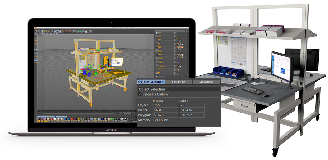
It was challenging to learn and familiarize myself with 3D modeling using Cinema 4D while afterward, implementing every asset into Unity. Both programs I’ve never used before and several courses on the Unity gaming engine, 3D modeling, texture mapping, and retopology were taken.
Afterward, device performance became a challenge, for project scenes topology had extremely high polygon count. Meshes had to be topologized into lower polygon counts, UV mapping projected to 3D model surfaces, and environment lighting/shadows baked allowing the application the ability to run efficiently on tablet devices.
Another challenge of this project was attaining access to potential users for research and testing purposes, as STERIS’ sales team worked all over the country and budget prohibited much travel. As a workaround, we held sessions with project stakeholders, many who have extensive backgrounds in sales and the company who closely match our main demographics and level of technical proficiency.
The approach.
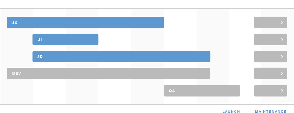
Working alongside project management and the account team, we decided to split timelines into parallel working paths. This allowed us to focus primarily on the main experience, design, and usability while simultaneously implementing app development and internal testing for quality assurance. Afterward, 3D Modeling and Environment creation for the Unity walkthrough would commence. These paths crossed at various intervals to help solve mutual challenges.
User stories.
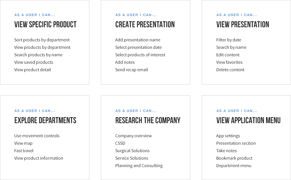
The first step was to organize and define the primary functions of the app. What tools and functionality would aid the sales representative, and how to implement a simple experience that would influence their customers while recording data? As a customer, what information would I like to see and gather from such a tool, and what would motivate me into making a purchase? By completing this exercise we ensured the end experience would accommodate user needs.
Task flow.
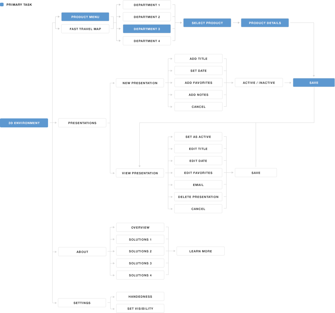
Next was time to define task flows from a user’s perspective to provide the simplest, most effective way of completing app goals. By doing so, the overall architecture of the tool began to take shape. The 3D walkthrough would later function as the primary focus, binding all other features together.
Wireframes.
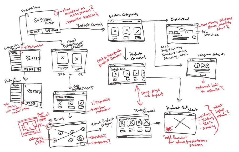
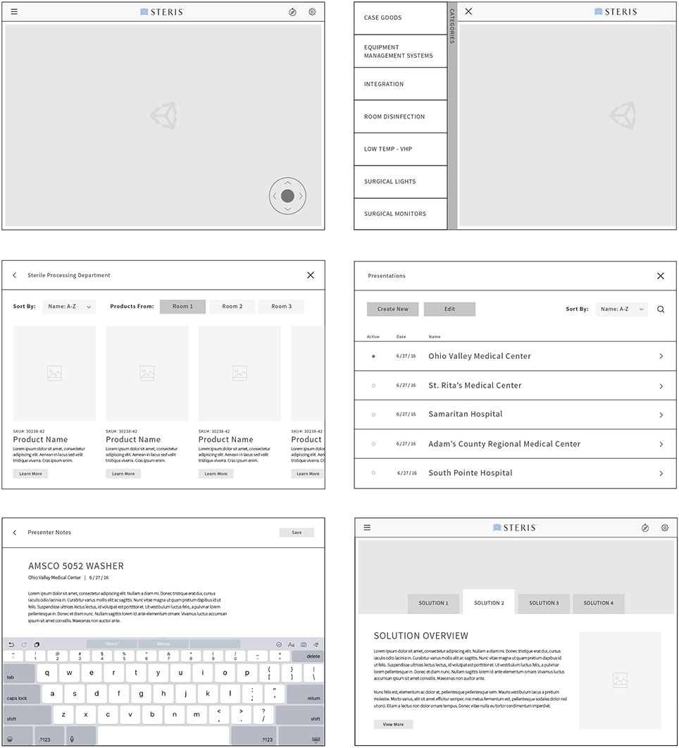
The next step was to visualize our task flow. To accomplish this I began with simple pen and paper sketches that were later presented and walked through with our clients and team. Once approved, detailed wireframes were designed and executed into a more comprehensive document. Working alongside developers and team, these were completed in close collaboration to avoid any possible technical roadblocks that may arise.
3D modeling.
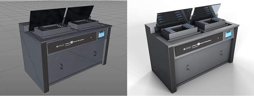
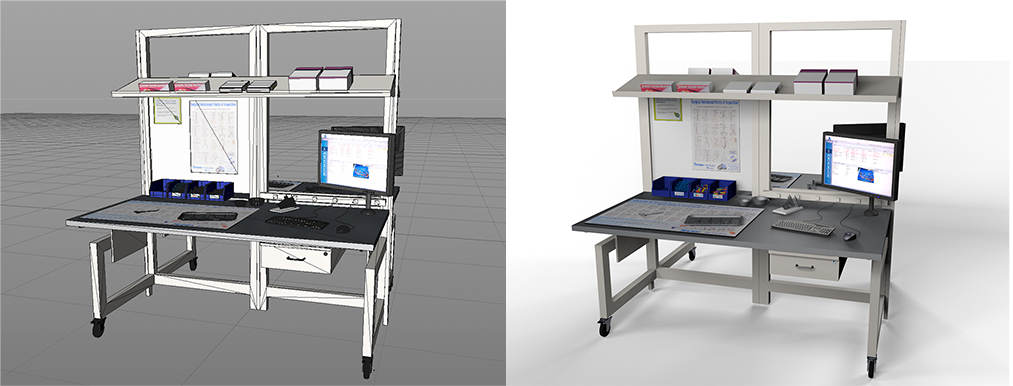
I was assigned as Art Director for several photography sessions held within simulated rooms at client headquarters, allowing us to capture every product angle and detail necessary. Afterward began my task of modeling the complete product offering, making sure textures, materials, environment, and lighting was accurately representative of the products within proper environments. The scenes were comprised of 3D models designed in Cinema 4D and running within the Unity game engine.

3D environments.
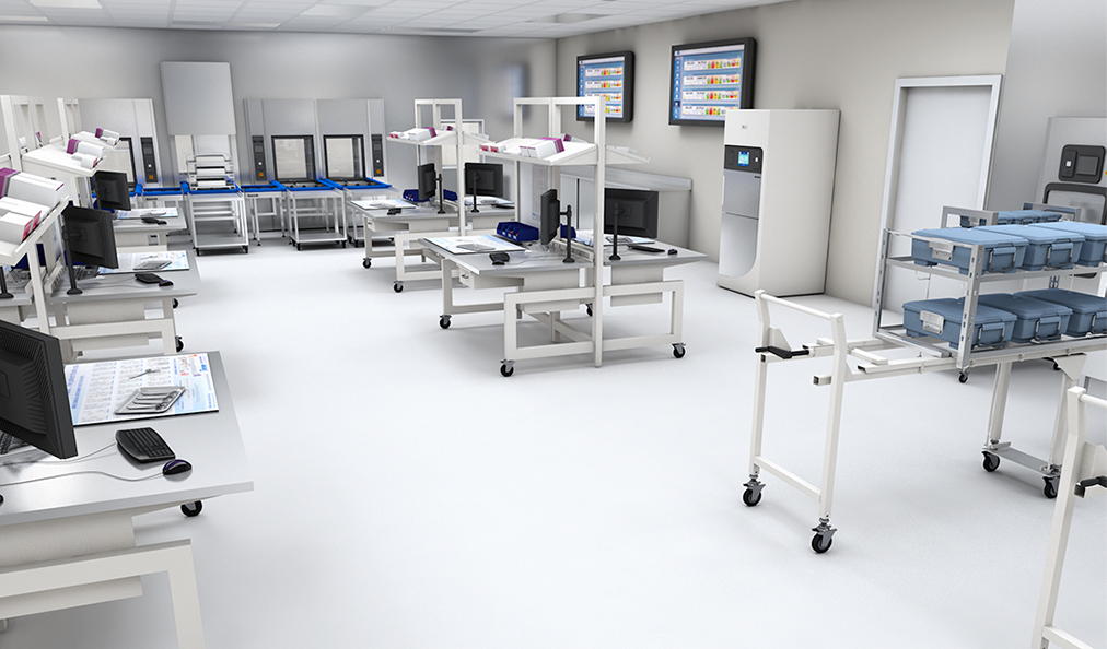
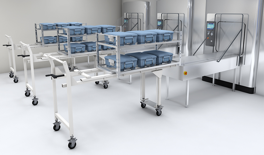
User controls were implemented within the environments permitting sales reps and clients the ability to freely explore the scenes, mimicking the feel of walking through an actual hospital while exploring STERIS’s product offering. Users began their journey in the lobby and provided the opportunity to explore Operating Departments, Sterile Processing Departments, and other sections of the hospital.

Controls.
User controls were implemented within the environments permitting sales reps and clients the ability to freely explore the scenes, mimicking the feel of walking through an actual hospital while exploring STERIS’s product offering. Users began their journey in the lobby and provided the opportunity to explore Operating Departments, Sterile Processing Departments, and other sections of the hospital.
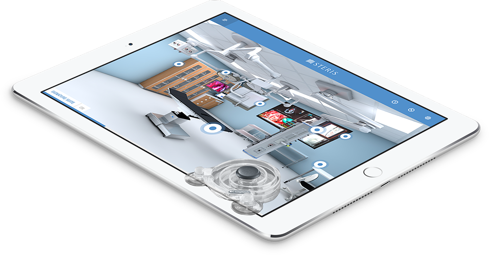
We ultimately landed in the middle of the complexity spectrum. It was impractical to implement a physical controller style for sales representatives to transport with the tablet. Knowing STERIS required users to move on a fixed track, restricting the capability to free roam, we implemented an on-screen joystick controller solution. The right joystick propelled the user forward and back on the track while opposite hand finger gestures allowed for camera viewport control.
Result.
We unveiled the tool at STERIS’ annual sales conference in Orlando where we led several onboarding and training sessions with the sales team. During this time we took advantage of user testing opportunities to improve the application, keeping in mind future features and functionality the team wanted to implement.
The response was overwhelmingly positive. We began receiving meaningful feedback weeks after devices were shipped and used in the field. Sales representatives mentioned they’ve been looking for a tool like this for many years, and the game-changing experience will lead to considerable new business opportunities. This feedback has led to minor usability and technical tweaks as well as larger discussions in expanding on the application.
Virtual reality.
Virtual Reality is here with a large number of consumer-ready headsets on the market. With this new technology available, we decided it would be a great opportunity to get introduced to the hardware and methods of building out these immersive experiences. Using the HTC Vive, SteamVR SDK and Unity, I was able to create a fully immersive prototype from the ground up. Wearing the VR headset, I was able to place the user into our 3D STERIS environments with the ability to explore departments and interact with the equipment and various other objects utilizing HTC Vive’s motion-tracked controllers.