Travel the road less taken.
Transforming the Airborne Bicycles brand into a more exclusive, higher-end product than ever before with a rich e-commerce platform and complete brand, site redesign.

Airborne is an ideal choice for aspirational downhill and mountain bikers. Originally founded in 1997, they were one of the first bike companies to sell directly to consumers. In 2010 they were reborn with the backing of Huffy Bicycle Company.
Years later they engaged us with the tasks of rebranding and redesigning their existing e-commerce experience to align with customer needs, best practices, and business goals
Enthusiasts on a quest.
Airborne is an ideal choice for aspirational mountain bikers simply because their corporate thread is weaved into their consumer’s social fabric. They are out there riding, taking risks, overcoming challenges and living the sport by their side. They know bikes, biking, and love talking bikes. Those conversations lead to innovation. Moreover, they help develop an understanding that durable, quality components, lightweight frames, and original design shouldn’t require a six-figure salary.
The challenge
Performance and style.
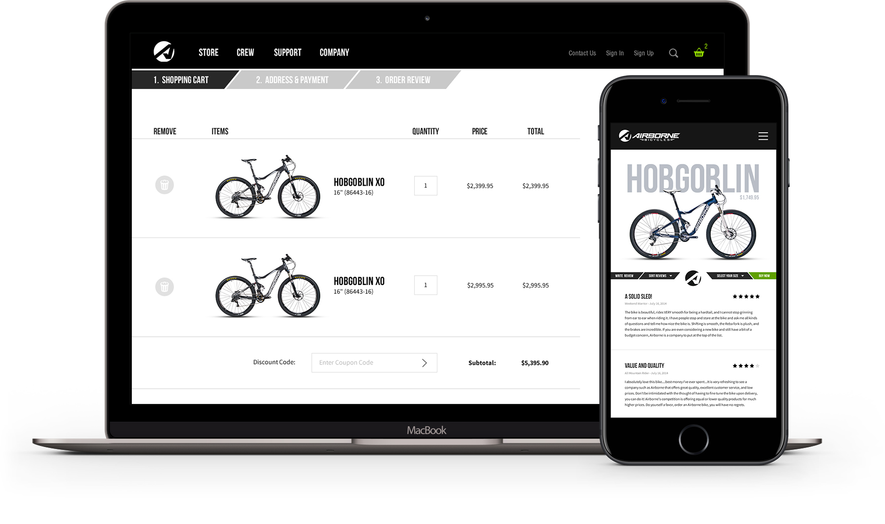
Airborne is doing great things for the bike industry but their existing B2C experience was lacking. A huge part of the brand image comes through the website, especially since it’s the primary place their products are sold. It needs to make people comfortable enough to purchase a lesser-known brand over the web, without a test ride and physical presence.
Core e-commerce functionality and usability concerns were prominent. Our goal was to communicate and create a sense of legitimacy and prestige for the Airborne brand and products with a best-in-class online shopping experience driving direct to consumer purchase.
What is working:
- Professional looking bikes with solid specs and great prices.
- Devoted, active and vocal fans.
- Great grassroots marketing through the Flight Crew, bloggers, product reviews and social media.
What is not working:
- Consumers don’t know about the brand.
- The website might be the only contact with Airborne during the buying process.
- Competing against well-established brands: Santa Cruz, Specialized, Transition, Trek, and Yeti
The goal.
Greet customers with an easy to use, yet informative e-commerce experience that is just as stylish, modern and well-designed as Airborne products.
My role.
I led the UX and visual design for Airborne Bicycles, collaborating closely with two other designers accountable for driving redesigns on Huffy Bikes and their other sub-brand, DK Bikes. Partnering with an Account Director, Project Manager, Copywriter, and three Developers, I was responsible for end-to-end experience strategy, information architecture, visual design, and all major deliverables in direct communication and collaboration with our client and pro riders.
Operating alongside the development team, we made sure all customer concerns, product goals, enhancements, and features were implemented flawlessly, producing a simple, more cohesive online shopping and Huffy brand experience for a special Christmas product launch.
The research
Early insights.
To create a great product that’s truly relevant to Airborne’s customers, it’s always imperative to work within a user-centered process. Collecting qualitative and quantitative research aided in building a transparent perception of the website and customer experience at the current state.
Stakeholder interviews.
Several stakeholder interviews were conducted to gather business requirements and obtain a better understanding of what we don’t know and what we need.
“The Airborne site could use a more focused approach on competitive products and how buying directly at our spec level is better than buying from a box chain”
“The website look and experience is critical to connecting consumers to buy a bike they have not seen in person. The current Airborne website is VERY VERY out of date and poorly executed and does not match the level of execution that the bikes possess. Needs total redo. Needs to LOOK expensive, higher end.”
Areas of improvement:
- Improved design
- Navigation
- Product information
- Product sizing
- Assembly / maintenance manuals
- Customer support
Desired enhancements:
- Responsive design
- Bike finder
- Strong brand / product videos
- Social Media / user generated content
- Trade show and event calendar
- Ratings and reviews
Customer surveys.
Below is a short preview of various questions that were asked to a handful of customer participants. This was critical to understanding existing behaviors, constructing personas, and identifying pain points and areas of improvement.
How did you first learn about our product / website?
What do you like least / most about our product / website?
How easy is our website to use?
Which features of our product are most important to you?
What is the most important feature you think we should add?
Results were beginning to align with trends emerging throughout the research data that supported the start of top issues and troubled area prioritization.
“I want a high-end quality bike that doesn’t break the bank.”
“I look for a reputable brand that I won’t feel embarrassed about riding.”
“I’m interested in the latest info on trends, products, innovations, and downhill news so I can be the first to bring it up with my riding crew.”
Important takeaways from survey results:
- Could not find bike prices.
- Checkout is confusing.
- Manuals not listed.
- No bike fitting section.
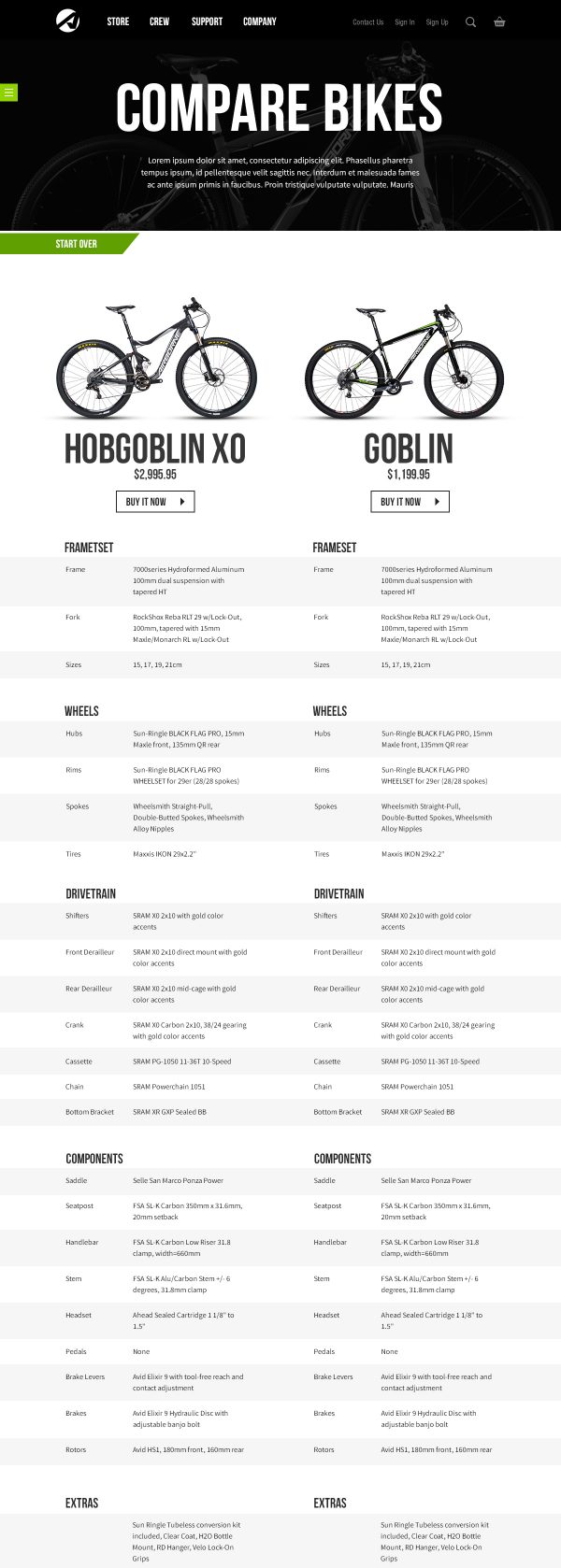
- No compare feature.
- Inventory errors.
Competitive analysis.
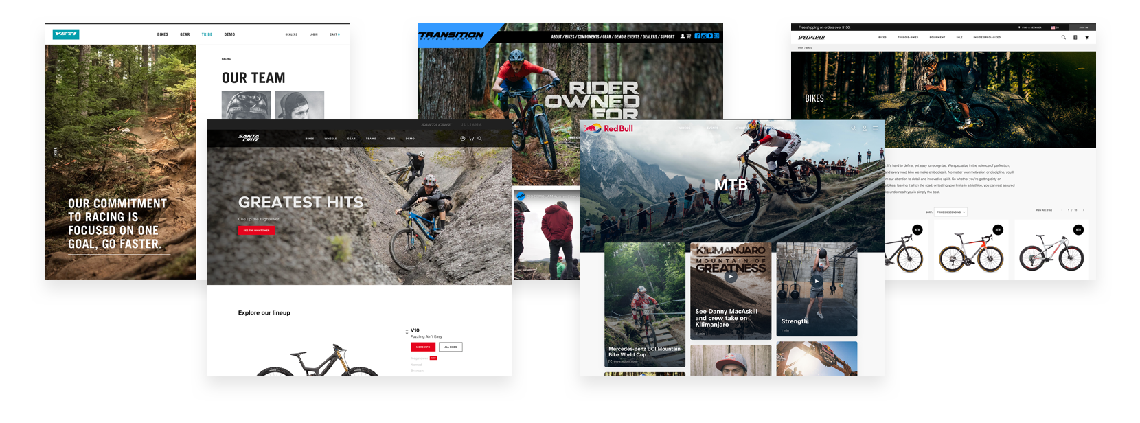
Auditing and collecting data from the competition, along with several related companies, gave us a solid overview of the common landscape, unique product features, and properties each contained. Evaluating this research we compared product features, visual design, voice, and tone to gain an understanding of what works well, what doesn’t, and how others execute.
Reframing requirements.
User research revealed various areas of opportunity. Project requirements based on research was reframed and reprioritized into a fully-executable plan for an MVP approach, while still allowing for ideation around specific features and enhancements for our North Star strategy.

Building personas.
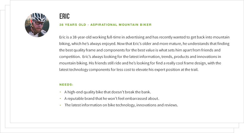
After acquiring substantial research around particular customer needs, concerns and goals, the team began mapping out and formulating various customer type personas with client stakeholders.
Persona types:
- Beginner
- Cross Country
- All Mountain
- Downhill
- Trail
- Professinal
Journey mapping.
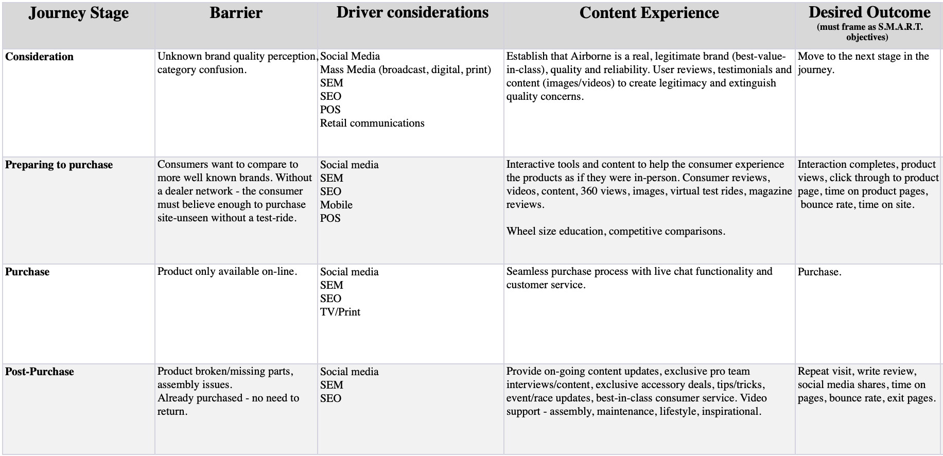
Journey mapping our customer’s path from brand and product consideration through post-purchase was essential to understand and rationalize well-defined activities, scenarios, and persona perspectives.
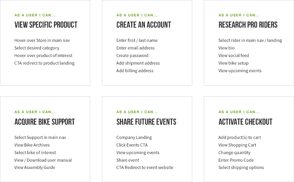
User stories were next produced as a holistic path in understanding our consumer’s functional needs in association with what they aim to accomplish throughout each stage of engagement. Visualizing this journey helped formulate customer empathy in parallel with requirements needed to build customer experience routes.
Task flow.
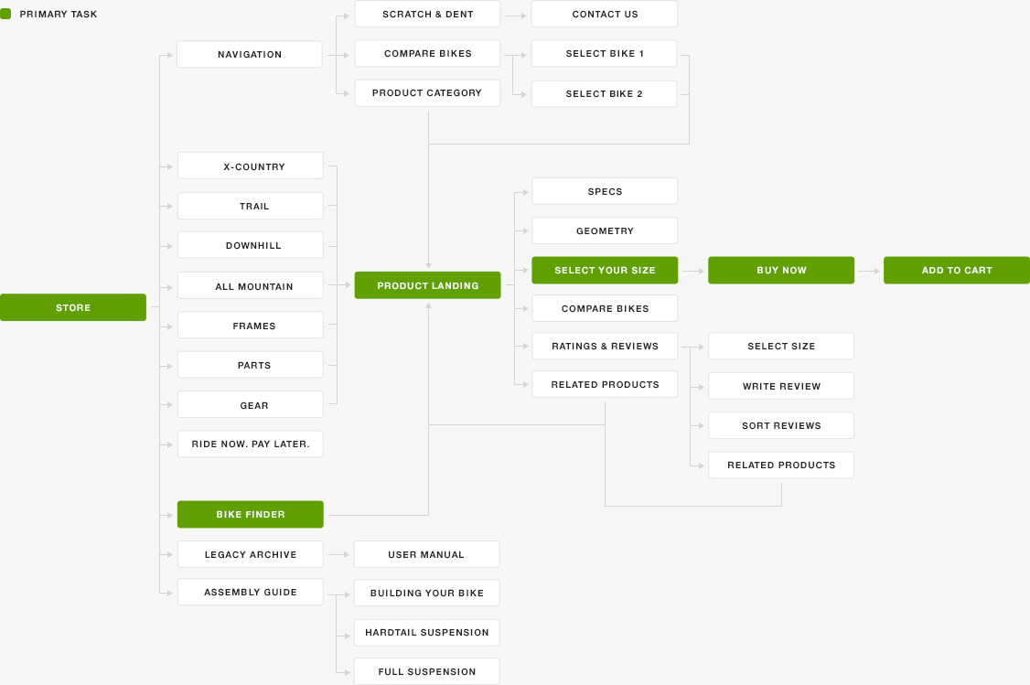
Task flows supported in rationalizing user steps and actions through a potential new site structure. Helping us refine the current e-commerce experience along with captured research to inject customers within suitable scenarios.
Site map.
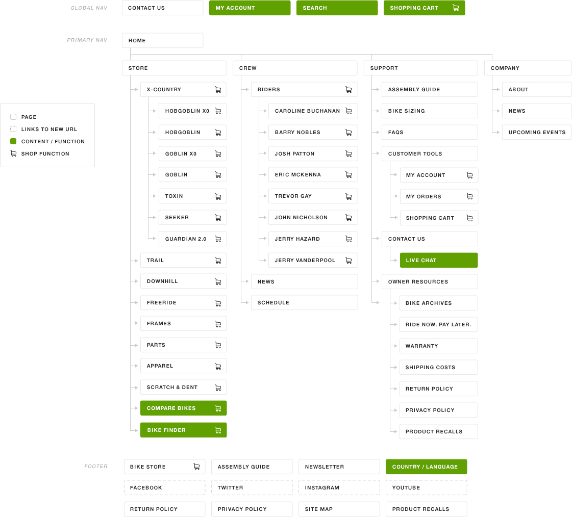
My next task was to take the established project goals, features, and enhancements and restructure the site’s content with a newly organized, yet well-defined site architecture before moving into exploration with wireframes and visual design.
Wireframes.
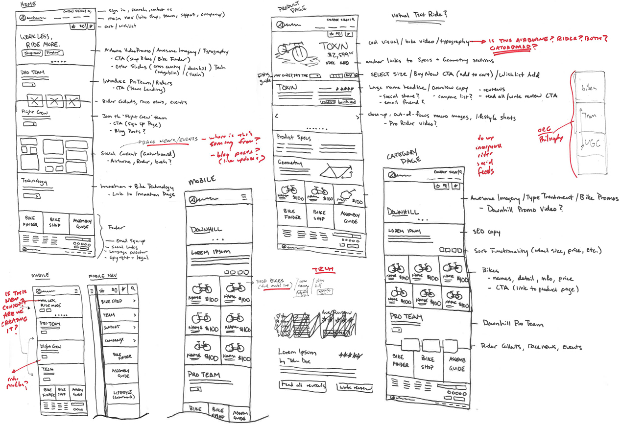
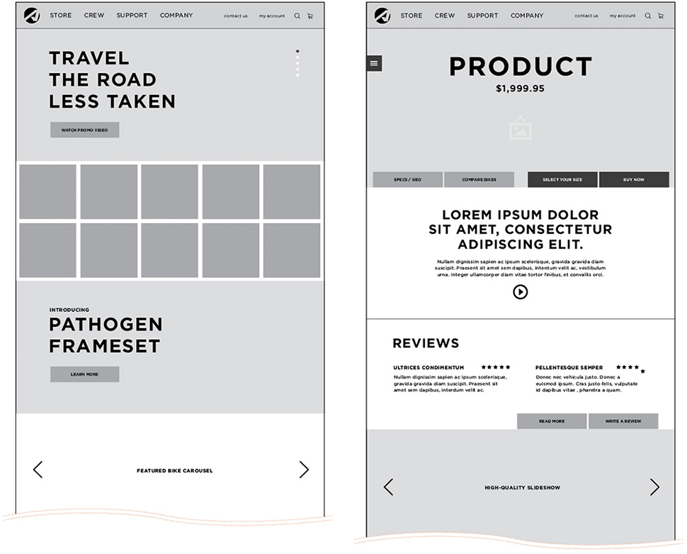
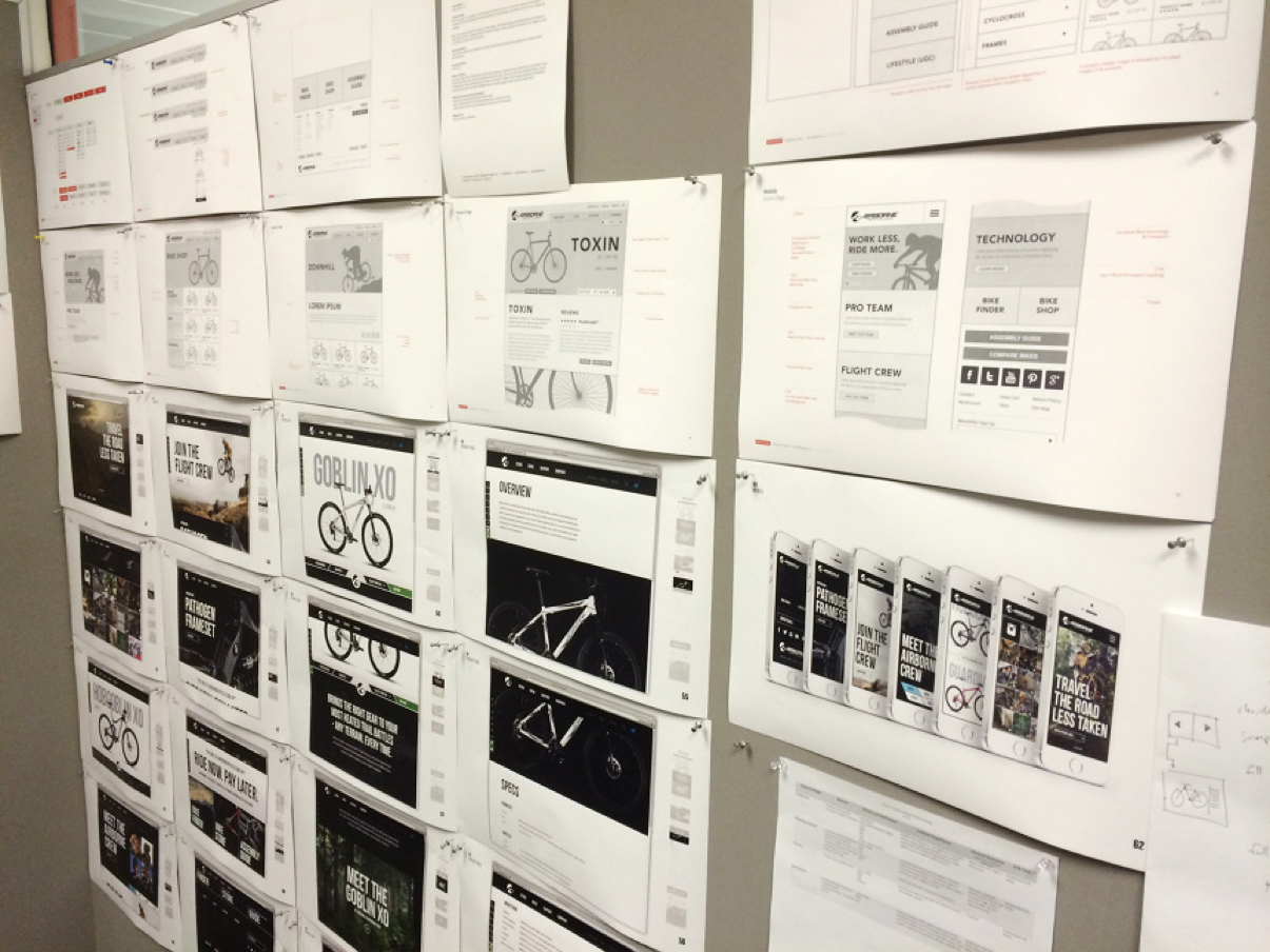
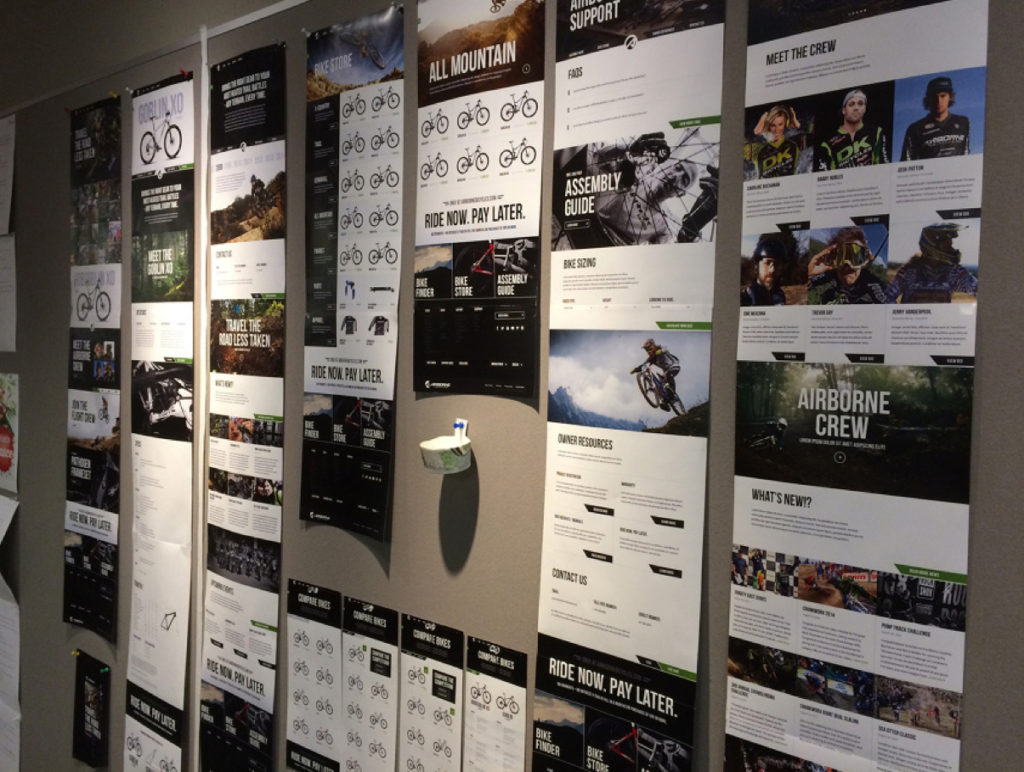
Detailed wireframes were created based on sitemap approval from internal and client stakeholders. These started as rough paper sketches that eventually evolved into low-fidelity clickable prototypes using InVision. Creating a simple representation of the user interface, and how the customer would potentially flow from homepage to checkout.
Usability testing.
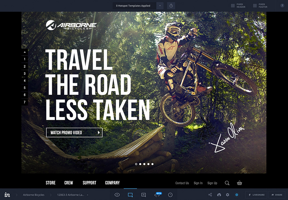
Respecting the stringent timeline and creeping launch date, we concentrated our usability testing efforts with the same group of customers and stakeholders from our discovery and research phase. After presenting end-to-end product strategy, information architecture and high fidelity comps to our clients, approval was given to move forward with InVision clickable prototypes. We observed, the feedback was supplied, and comps were updated for final design before development.
The design.
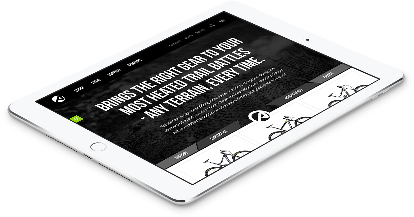
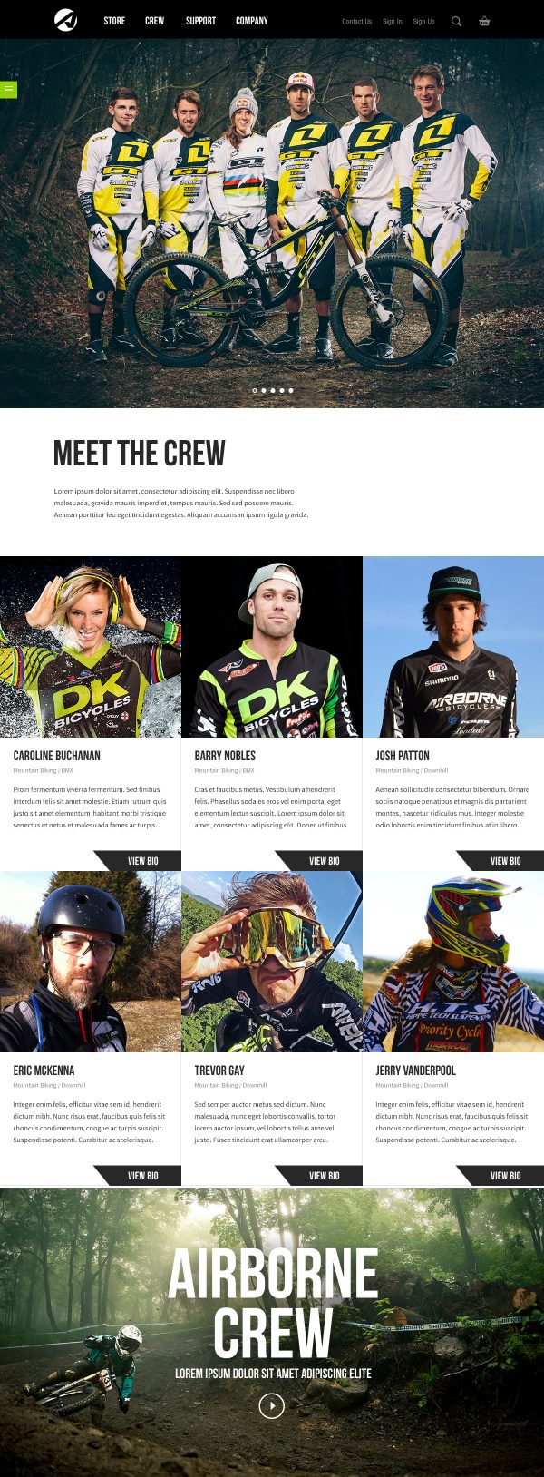
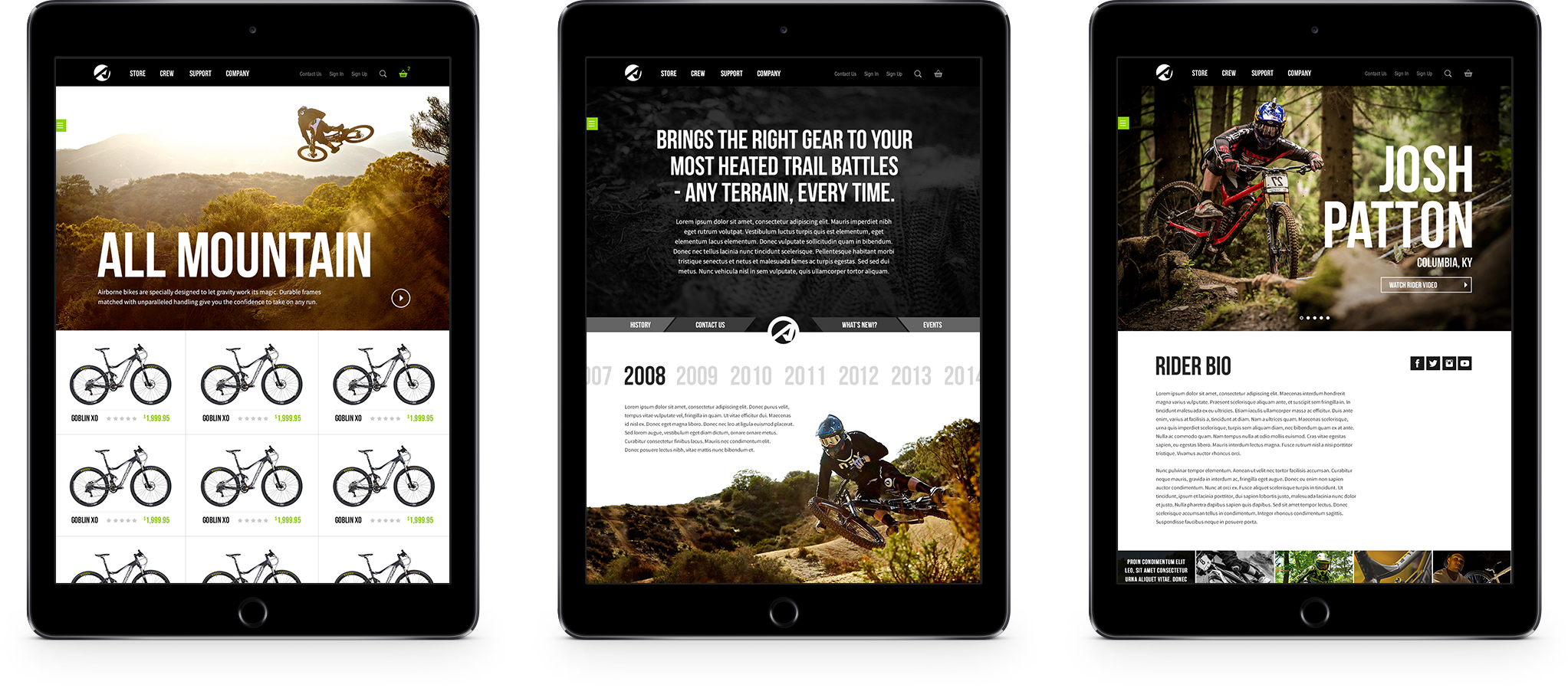
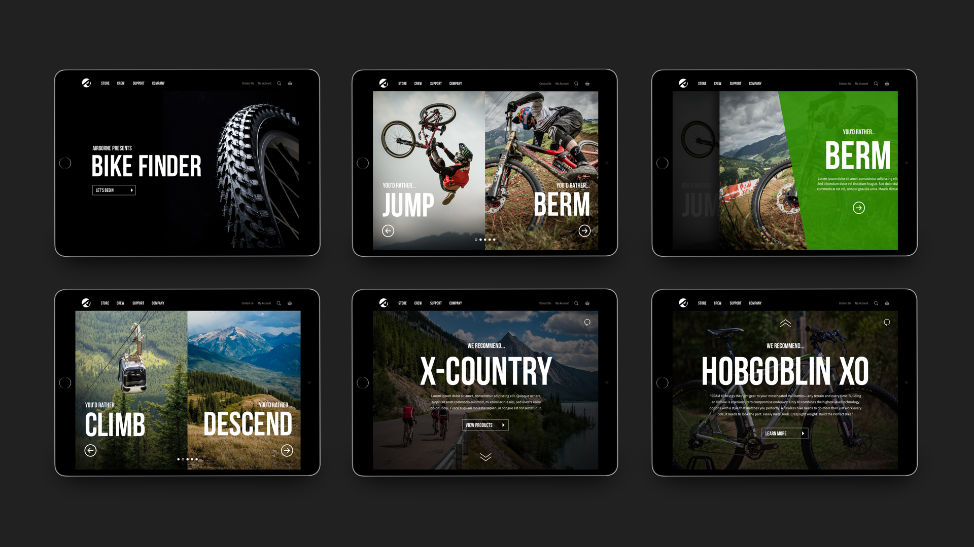
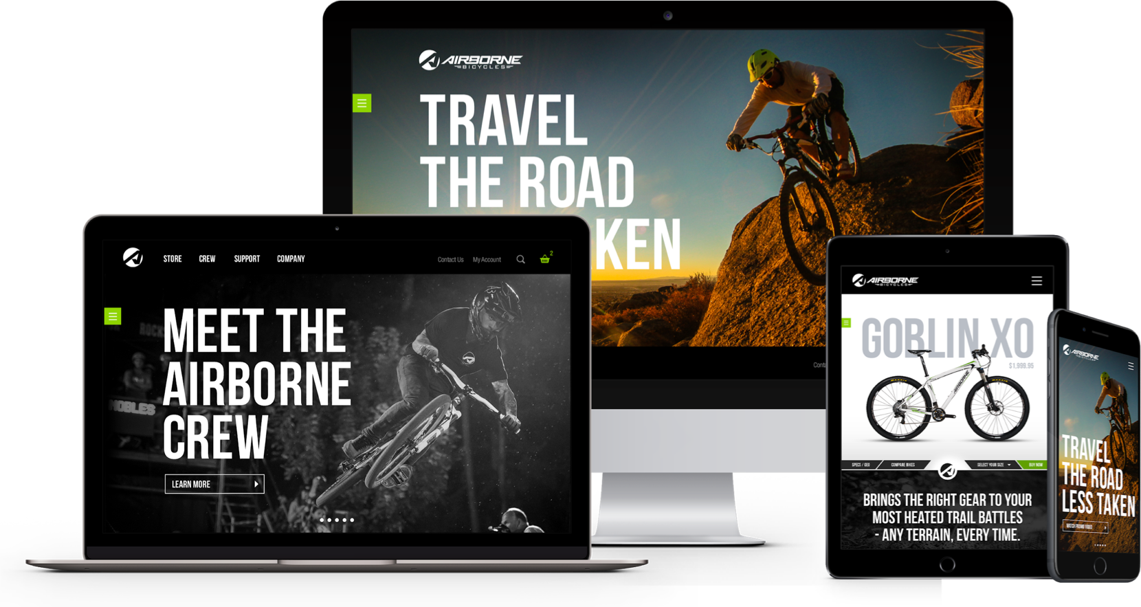
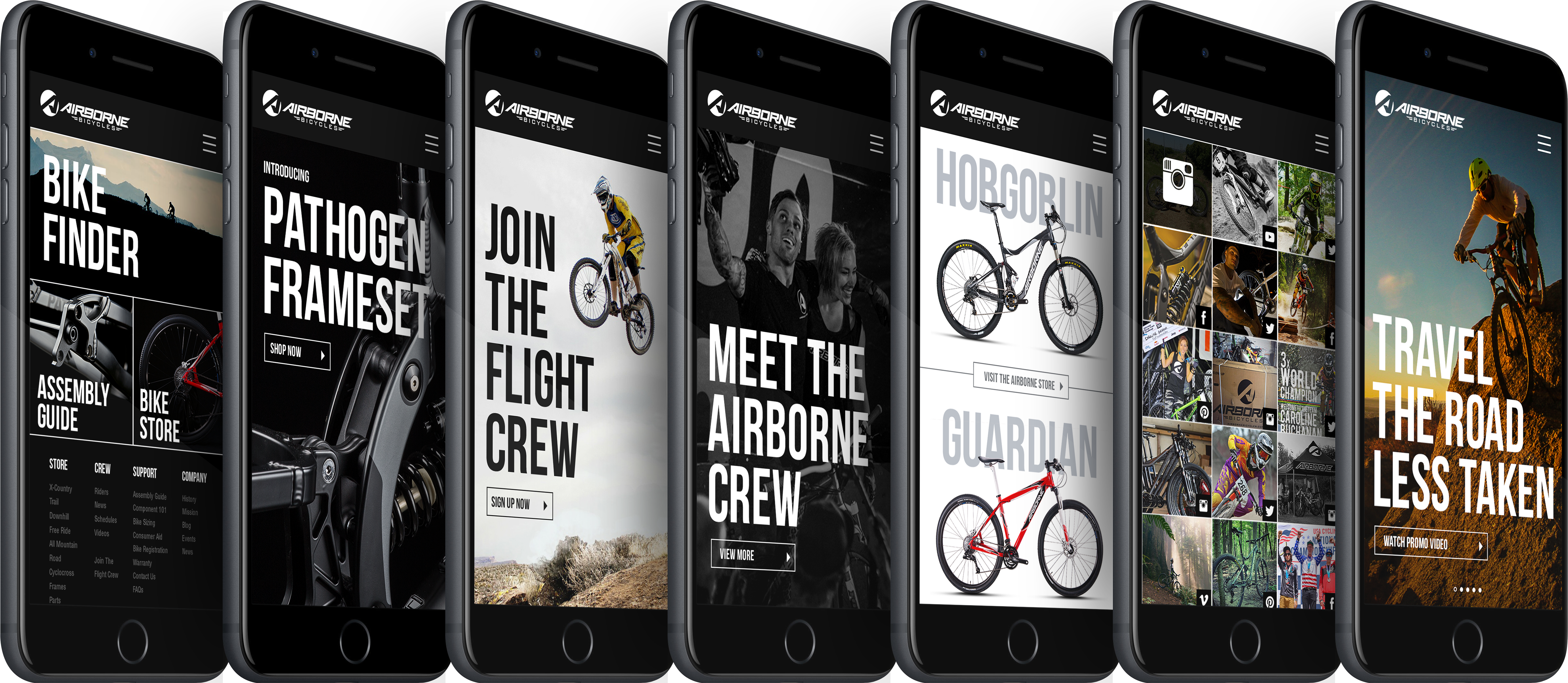
Accommodating Airborne’s new brand standards we created with my refreshed UI converted the brand into a more exclusive and higher-end product than ever before, gleaming amongst the competition. Having the opportunity to work with professional riders such as Barry Nobles, and multiple world championship and olympian Caroline Buchanan, gave us the capacity to construct exceptional content for the site. The website’s shopping experience and overall brand, product awareness helped produce better site traffic, analytics, customer satisfaction and revenue than ever before.


